You’ve worked out the materials for the asset, applied advice from other artists, and created realistic textures. All that remains is to figure out how to evaluate them, what to pay attention to, and what parts to refine.
Artifacts / Incorrect Values on Textures
First, we load the model with textures into the engine (we use Marmoset to present the assets, but it can also be Unreal Engine, Unity, or any other) and check for obvious errors and artifacts.
At this stage, we most often encounter these problems:
Noticeable Seams

Seams can appear because of improperly baked cards or, for example, the UV Projection/Tri-planar Projection settings when overlaying grunge cards in Substance Painter.
The Result of the Illogical Operation of Generators

The dirt generator created a ridiculous dust-up because of the artifacts on the AO.
Tiling

Tripple tiling inside the texture was caused by the settings of the grunge map that was used in the texturing.
Incorrect Color / Roughness / Metalness or Gloss / Spec Parameters

Wagon rooftop.

Gloss. Monotonous and illogical.

Albedo. Too black + tiling.

Final result. Monotonous and unrealistic.
Use the PBR Validator tool in Substance Painter to check if the textures match the PBR rules.

Take the time to do this, so that no one at ArtStation will be able to find fault with your asset in the future.
Artistic Aspects of Texturing
When judging textures it is important to pay attention to the general features first, and only at the end to the fine details. First look at the colors you choose, the visual differences between materials (rubber will be different from paint or plastic), the level of gloss, and so on.

The fabric and leather create a contrast of matte and shine. Author: https://www.artstation.com/artwork/L32zYr
At this point, it’s important to understand how the viewer perceives the object in the first seconds of viewing. Is there something to catch the eye? Does the picture look dull or flat?
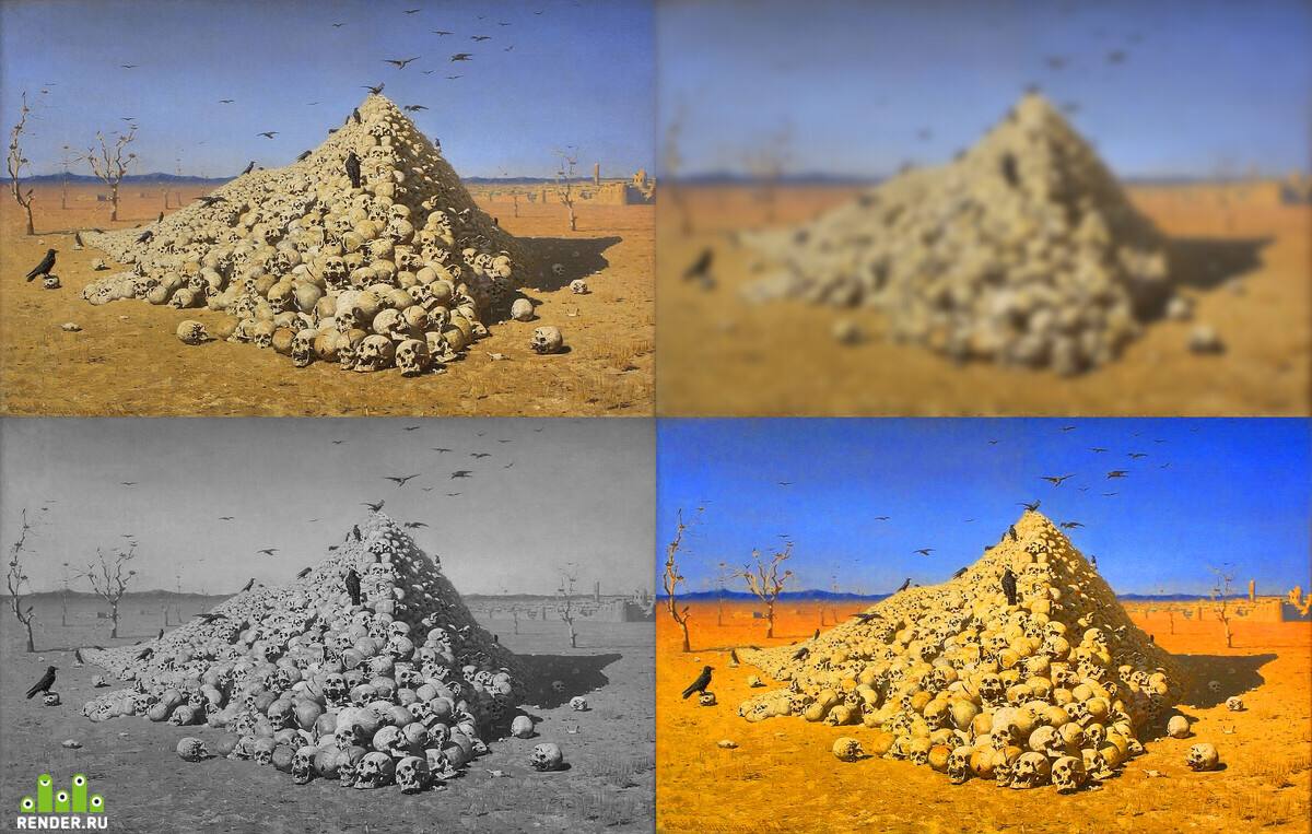
To assess the overall appearance of the object, without distracting from the details, you need to blur the rendering of Asset and a separate image to translate it into b / w. In the blurred image, fine detail will be lost. This will give you a clear view of the main patterns and the balance between them.
And in an image without color, the contrasts are clearly visible.

This is how you can evaluate any image, even paintings by famous artists.

Apotheosis of War, Vasily Vereshchagin

The Last Day of Pompeii by Karl Bryullov

Dogs Playing Poker, Cassius Coolidge
Contrasts
The human brain reads the information in stages, in several passes. At each stage, we pay attention to different aspects of the image. Evolution has trained the brain to read contrasts and patterns first. This has allowed us to survive for many years, and now you can use this feature to make your work more appealing.
Let’s look at two versions of the same object. One has contrasting dots and the other doesn’t. Which picture do you want to take a closer look at?

Pictures with bright spots attract more attention.
Contrasts are important to attract attention. They are possible not only in colors, but also in shapes, sizes, and materials. A fabric lying on top of a tank will create an interesting combination of light and airy with something heavy and sturdy.

The contrast between technology and wildlife. Author: https://www.artstation.com/artwork/18n2KL
Contrasts in Color and Roughness / Gloss Map


If you forget about contrasts, you get monotonous textures with no highlights or interesting spots. That’s why Substance Painter and Marmoset Viewer have the ability to look at each map individually right on the 3D model.

Suppose you suspect that the highlights are too flat and monochromatic. In that case, you should study the roughness map with the help of Marmoset or Sabstant debugger (debugger in this case is a tool that allows you to look at different textures directly on the object separately from each other). You may have to work with point contrasts or adjust the entire texture with the Levels tool.
The Connection Between Color, Roughness, and Elevation Map
The same debugger allows you to trace the correspondence of color, raffle, and elevation maps, and synchronize them with each other. For example, if there is a spot on the surface of the helmet, it is better to highlight it not only by color but also by glare. The oil should shine and stand out against the paint, while the dirt, on the contrary, should diffuse the light and create a matte stain.

When it comes to chips or scratches, however, the height map is plugged in. The scratch will now stand out in color, gloss, and depth: just as it would look in the real world.
Variety and Logic
If contrasts are all right, color and roughness support each other, but the object still looks boring, pay attention to variety. Perhaps there is a lack of detail in the asset. Then imagine how the object is used, and work out the signs of wear/aging.

The main thing is to add details on which the eye can linger when you look at the picture for a long time. Remember the logic and balance: each element must be justified, there must be a story behind it that it tells the viewer.

Working on the bar counter, you can add traces of worn wood in front of the bar stools. This way it will immediately become clear in which seat visitors sat most often, and how they leaned on the table. This is an interesting stage of the work, connecting all your creativity, but most importantly, do not overdo it.

Far Cry 5: Bar Scene by Andrew Averkin: https://www.artstation.com/artwork/mGbny
If you checked everything, but still there is something wrong, ask your colleagues, comrades, or mentor It is desirable to ask a person who understands the subject, but if this is not possible – anyone will do. The main thing is that the person should be interested in giving honest feedback, not in telling you how good you are.
A fresh look at your work is never superfluous. After a few days of looking at an asset, you get used to many aspects and don’t notice them. In such a situation, they say, “the eye has blurred”.

Always take the time to check the textures at the end of your work. After all, it’s easier to check them right away than to redo the finished renders from the engine after noticing a small bug. Stay tuned.
Slam from the example on ArtStation: https://www.artstation.com/artwork/OoGwGv